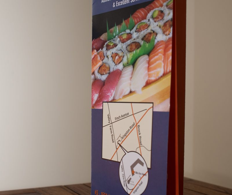
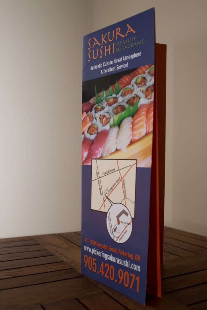
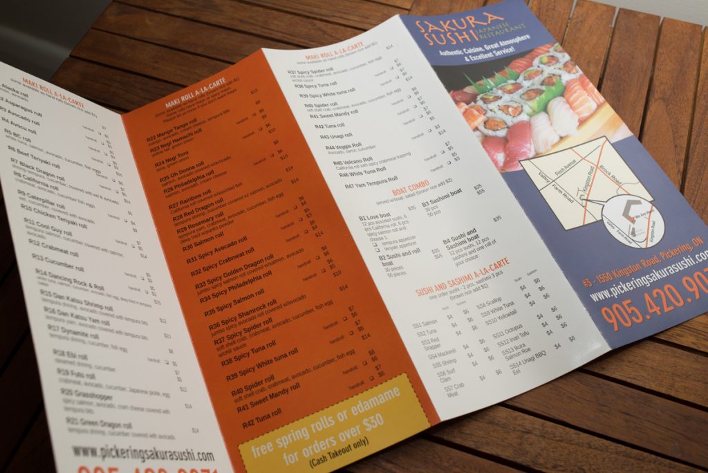
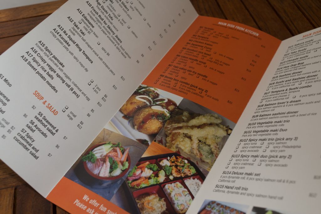
The Client had a sizable takeout menu that they wanted to kick up a step, visually. Rather than sending out text-heavy black and white leaflets with no graphics, we chose to add a variety of eyecatches, including fresh photos and bright colours, to compliment their takeout offerings.
