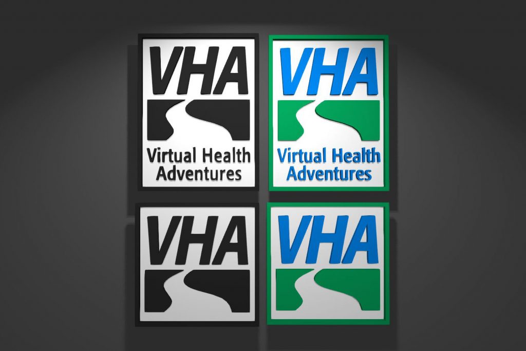
Client Virtual Ability required development of a logo with both verbose and abbreviated versions that would be eye-catching in both black & white and colour. Branding reflects a much larger program (which I also provided work for) which strove to provide education to recent amputees for use of their prosthesis and many related tasks.

